Bloom
Bloom is the end of year showcase for the third year communications and creative industries students at Charles Sturt University. Following the 2020 pandemic, Bloom has been an online festival. This year, I was lucky enough to design the identity and assets for the site.
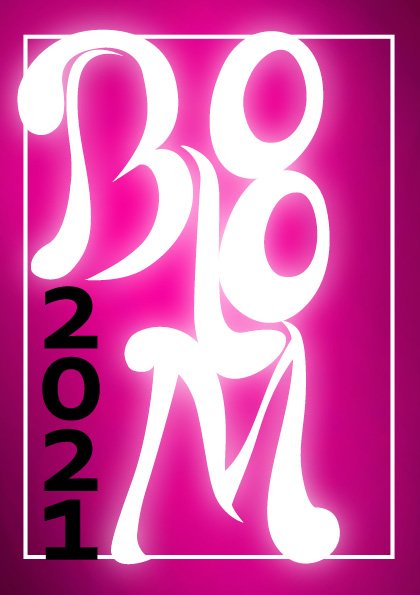
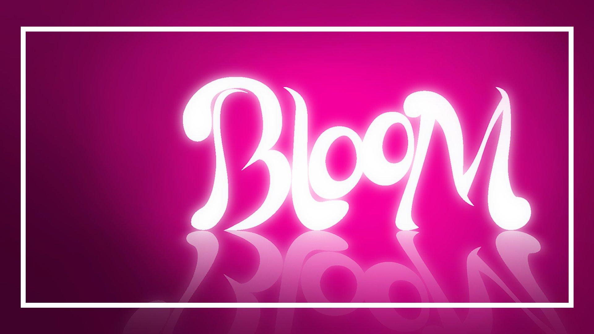
The early stages of the Bloom design were more complex than in other projects. Not only did I have a wide range of projects to encompass, but I also had no idea what these would be. What I did have for certain, though, was the word “Bloom”, and so I began with a word association exercise. This exercise took me to the concept of luminosity, which I carried through to the final design. The logo was originally hand-drawn, which I then digitised and polished.
You can view the full identity guide here.
Part of the brief was to create the social media assets to advertise the site. I wanted a bit of variety in the tiles while still maintaining their place in the set. I had two styes, the solid colour background tiles and student work tiles. I used a black and white version of the student works with a halftone filter. This was partially so that they would stylistically fit with each other and partially so that the social media tiles didn't give away too much of the gallery before it was launched.
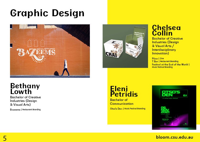
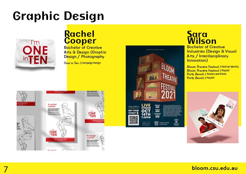
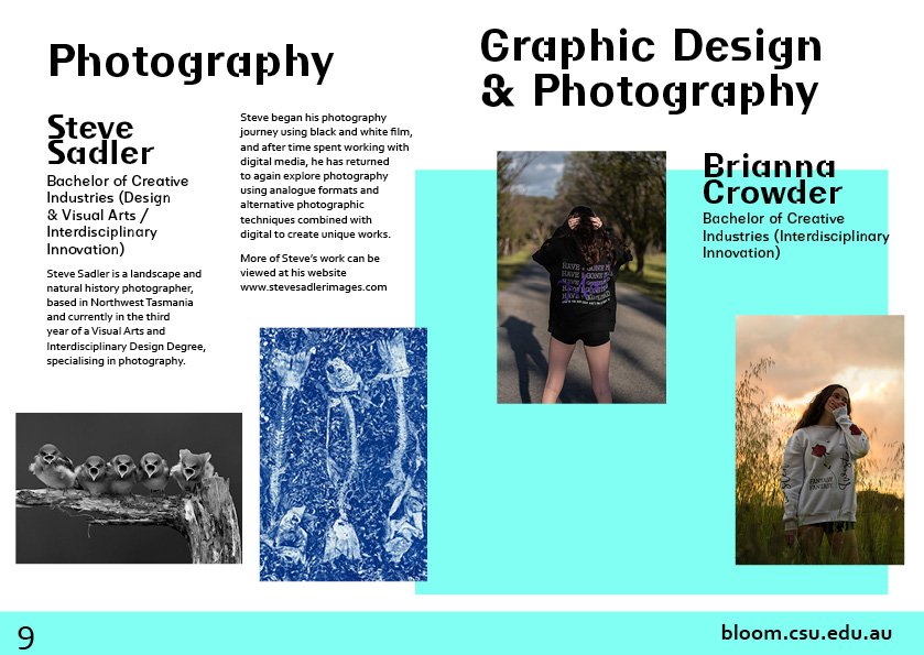
The program was the largest aspect of the brief. You can view the published program here.
